Nomet
A new visual language for a Polish manufacturer of furniture accessories
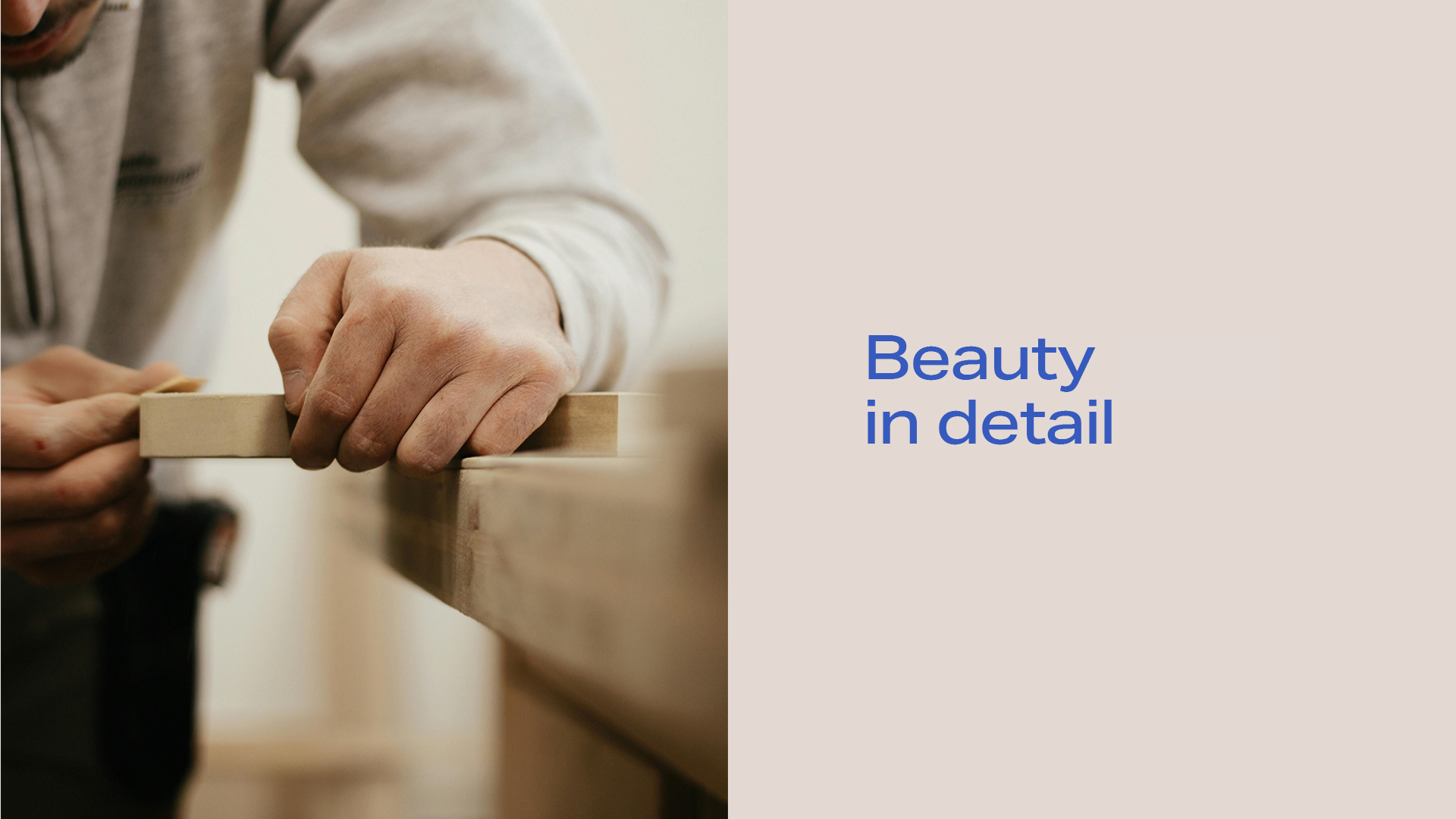
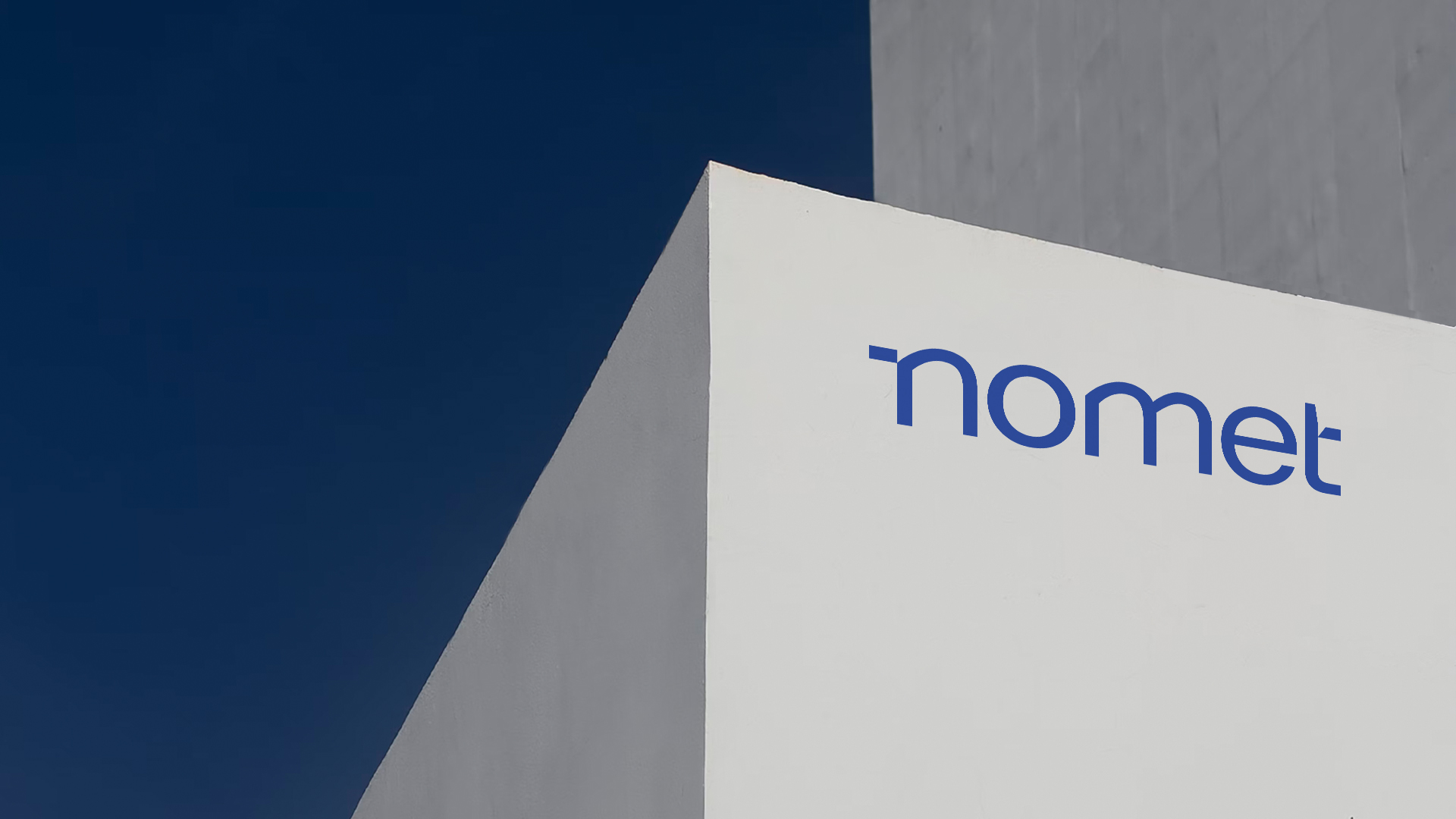
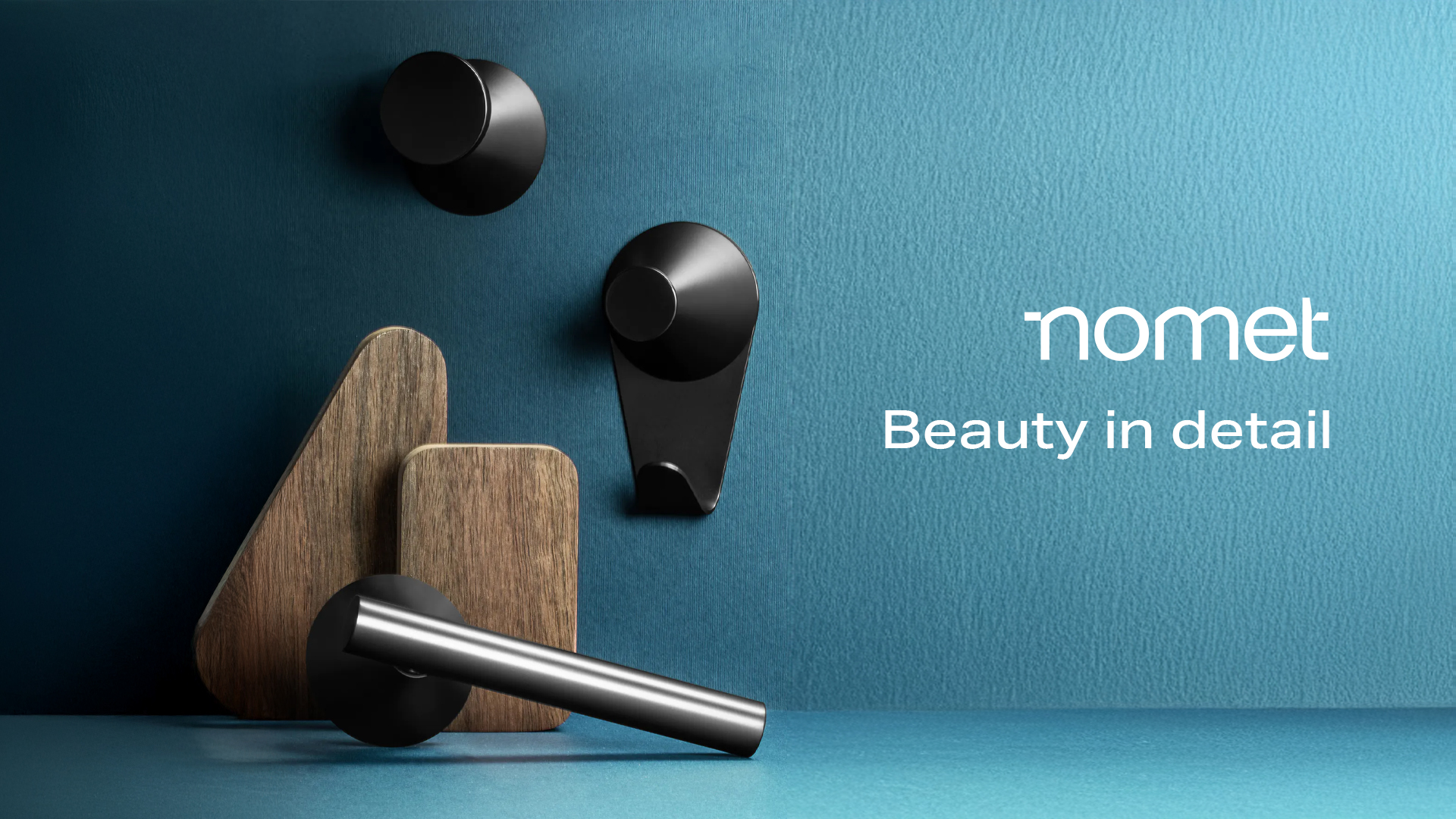
Nomet is a Polish company with over 40 years of experience in the production of furniture accessories – handles, furniture legs, grips – with its headquarters and modern production facilities in Toruń. The brand was in the process of implementing a new business strategy and needed a visual identity that would emphasize its established identity, be memorable, and easy to use across various channels and formats.
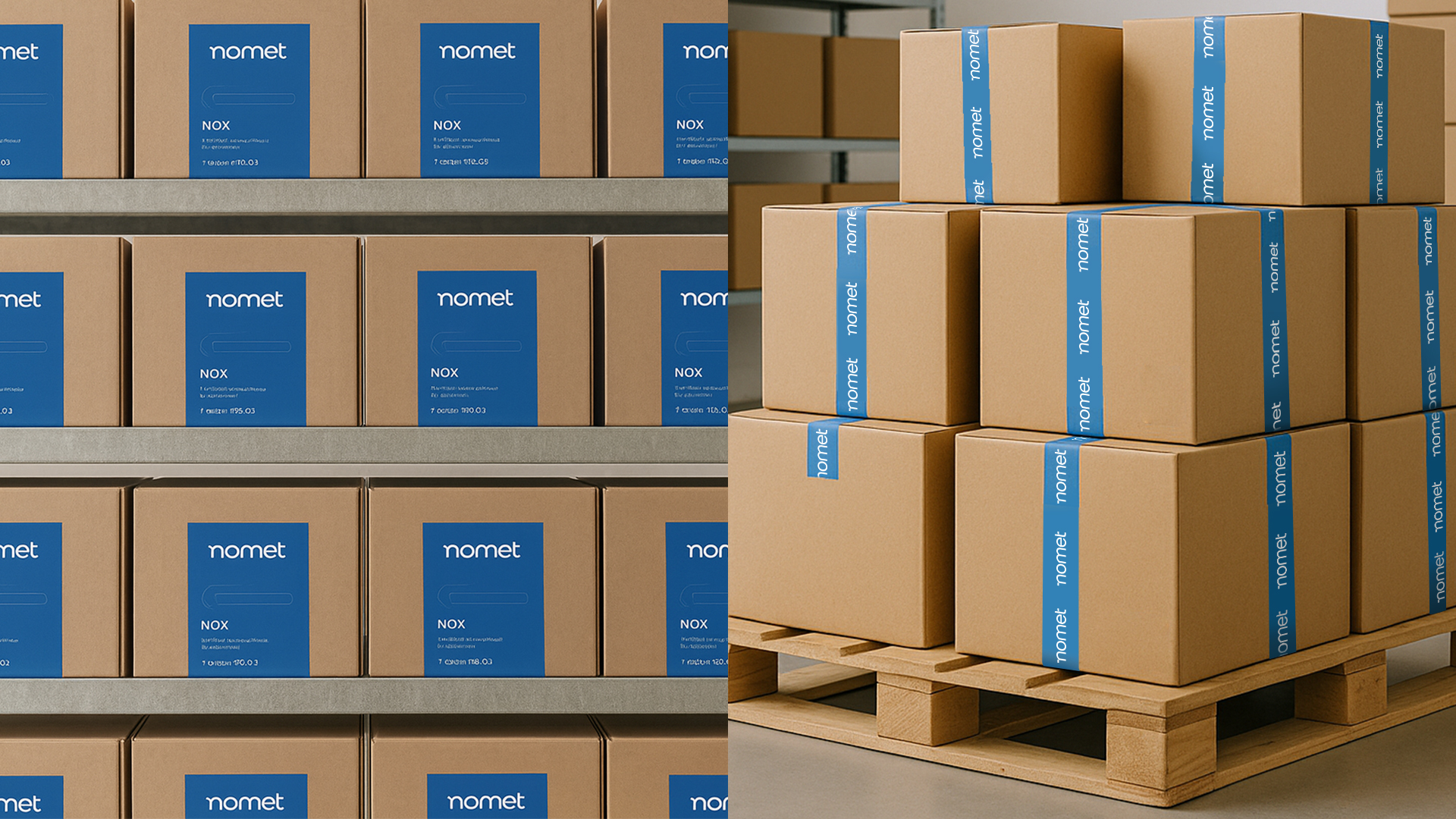
The biggest challenge was the wide range of materials created by a small marketing team – from social media posts, through leaflets and catalogs, to trade fair materials – in a short time and without consistent guidelines. The lack of clearly defined visual frameworks meant that projects were judged subjectively, which made it difficult to build a consistent image. In addition, the brand used a variety of packaging that required unification.
Project goals
- Creation of a consistent, flexible visual identity system adapted to the new strategy.
- Building a recognizable image at every point of contact with the customer.
- Development of a brand manual that would streamline the process of creating materials, shorten working time, and eliminate subjective aesthetic evaluations.
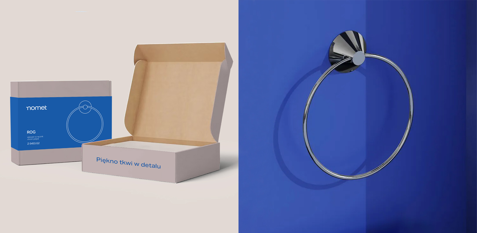
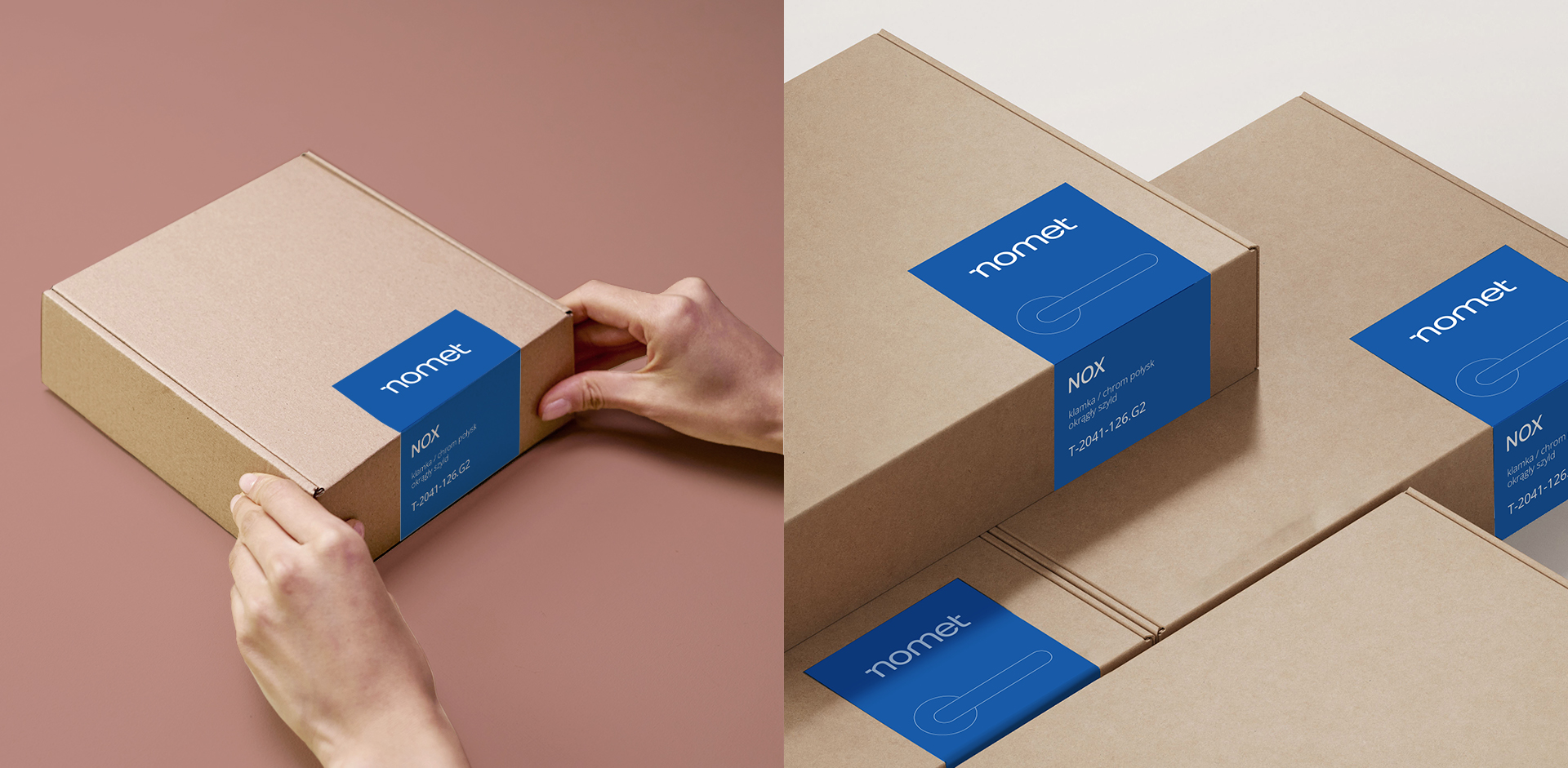
- Unification of the packaging appearance across different product lines.
Process
- Research and analysis – we conducted in-depth interviews with representatives of various brand departments, analysis of existing materials, communication channels, touchpoints, and packaging. We identified challenges and needs in the daily work of the marketing team.
- Strategic workshop – the meeting was attended by board representatives, managers, and specialists, which allowed us to look at the brand from strategic, operational, and implementation perspectives. We defined the visual direction of the brand, discussed the new identity and communication priorities, and developed the key assumptions for the brand manual.
- Consideration of different target groups – designing the identity required adapting the visual system to different customer segments: individual customers, architects and carpenters, as well as business partners (wholesalers, stores).
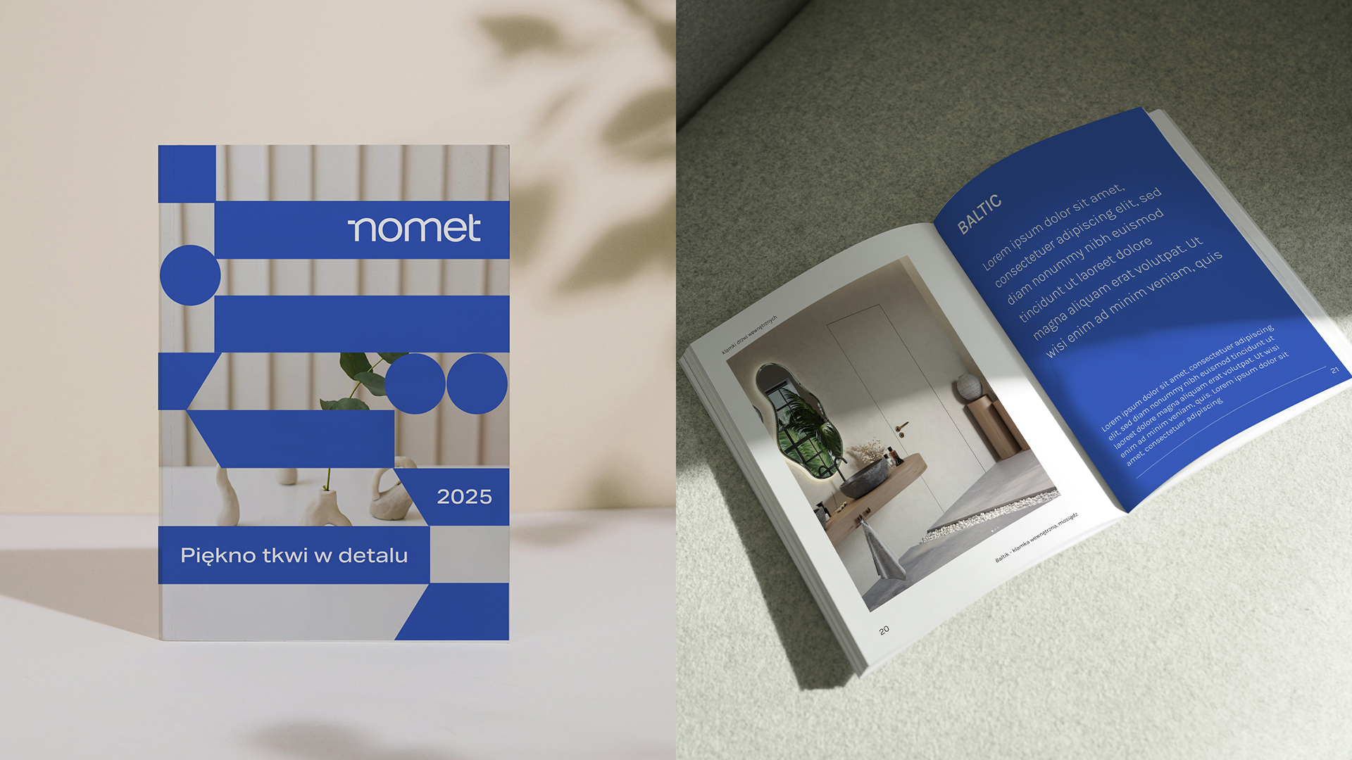
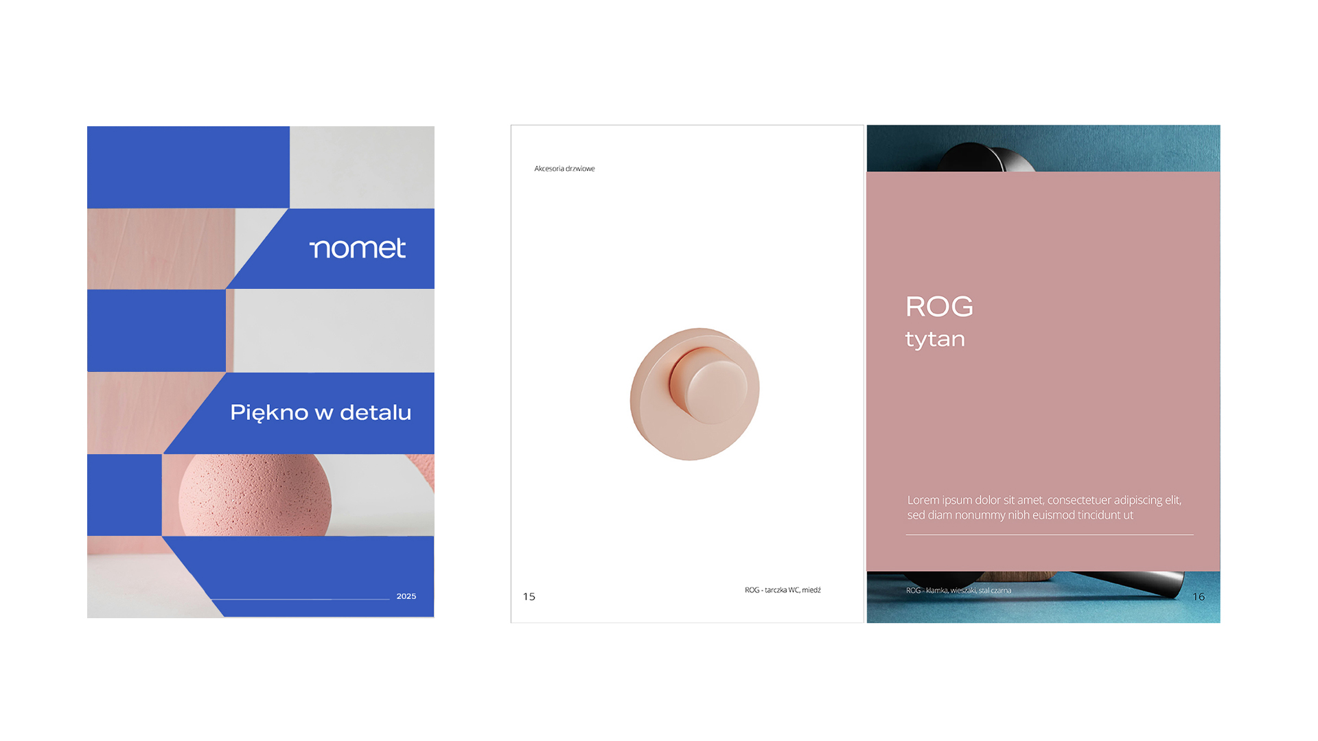
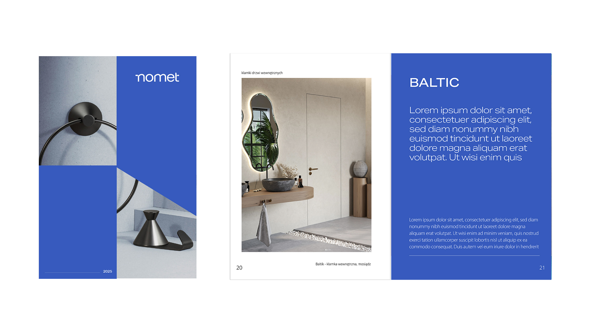
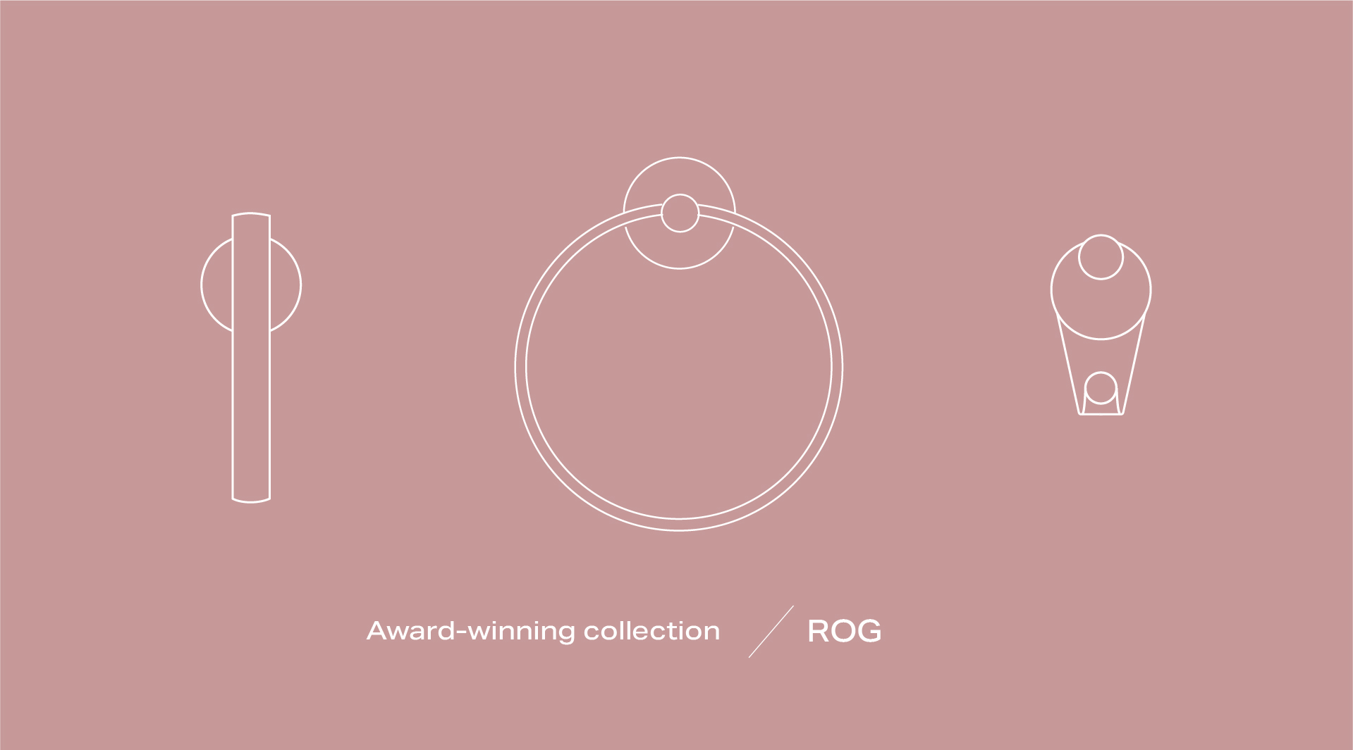
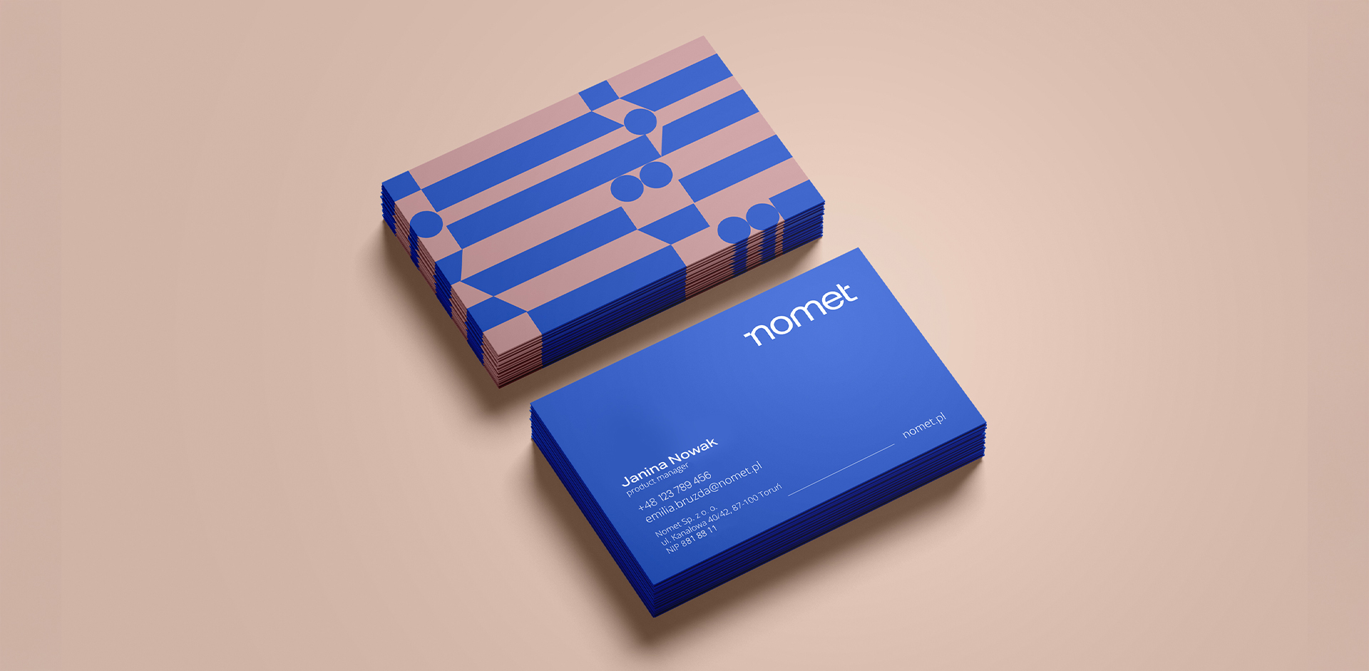
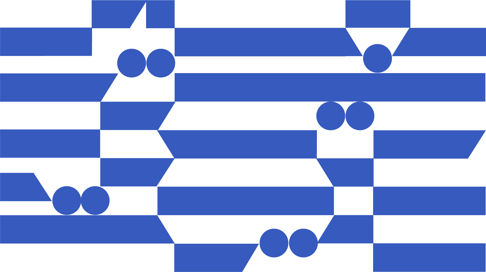
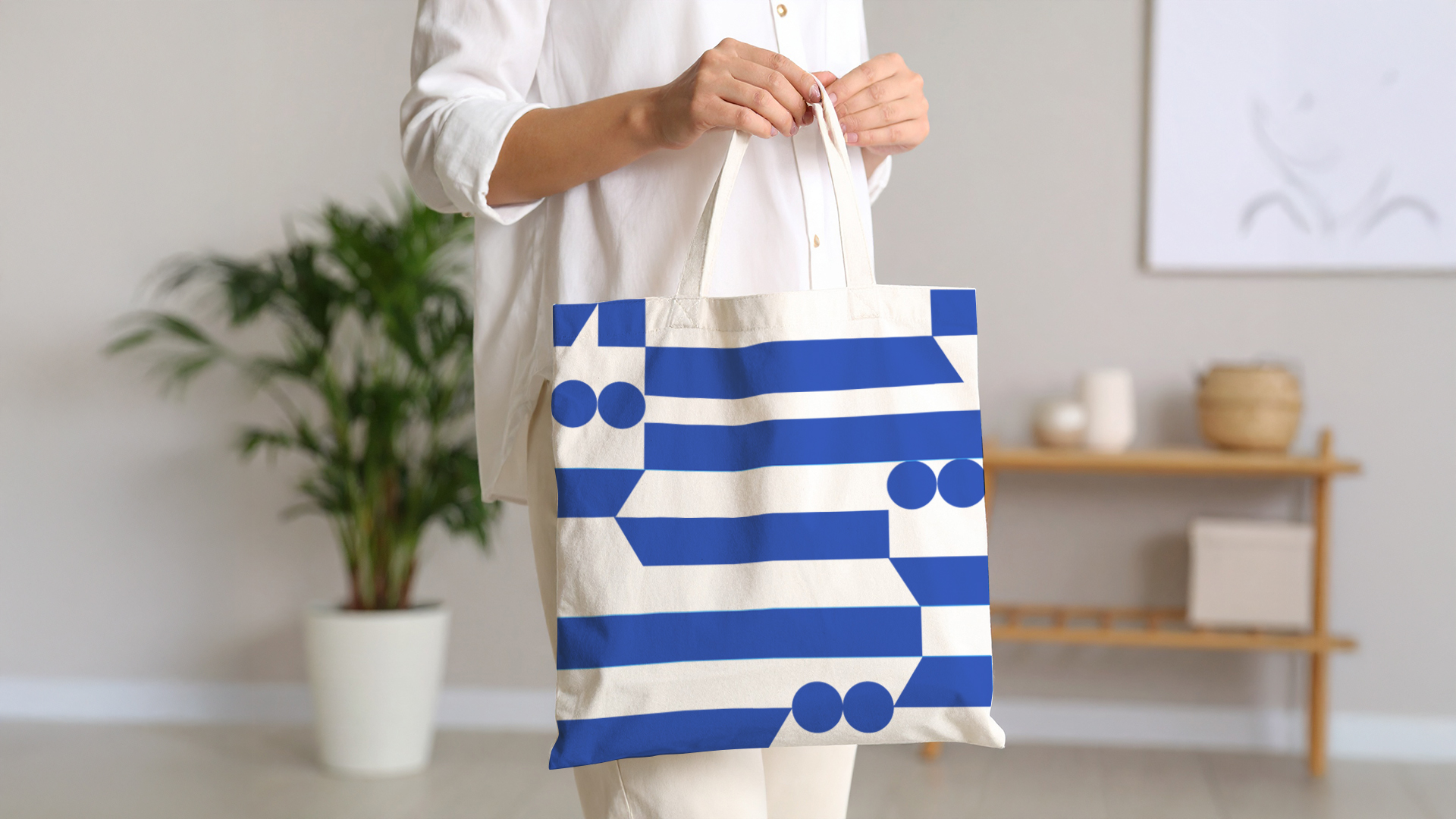
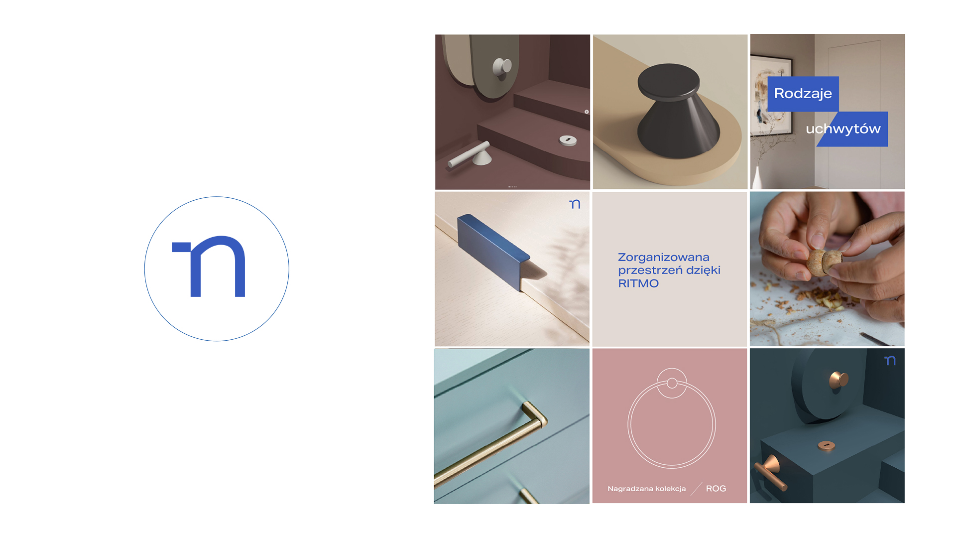
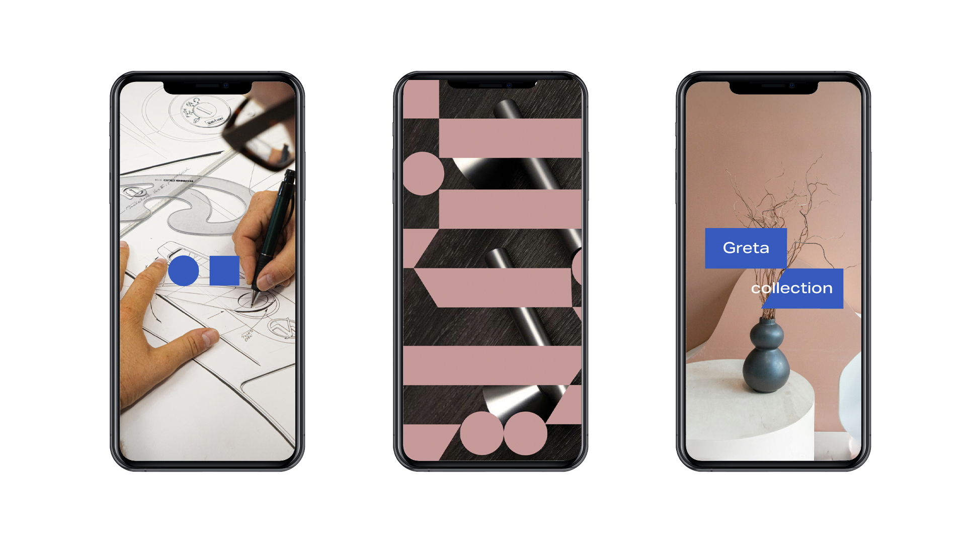
- Identity design – we created a new logo, a typographic family, primary and complementary color schemes, graphic elements, and a layout system.
- Presentation in context – we presented the identification system on real examples: packaging, printed materials, trade fair stands, social media.\
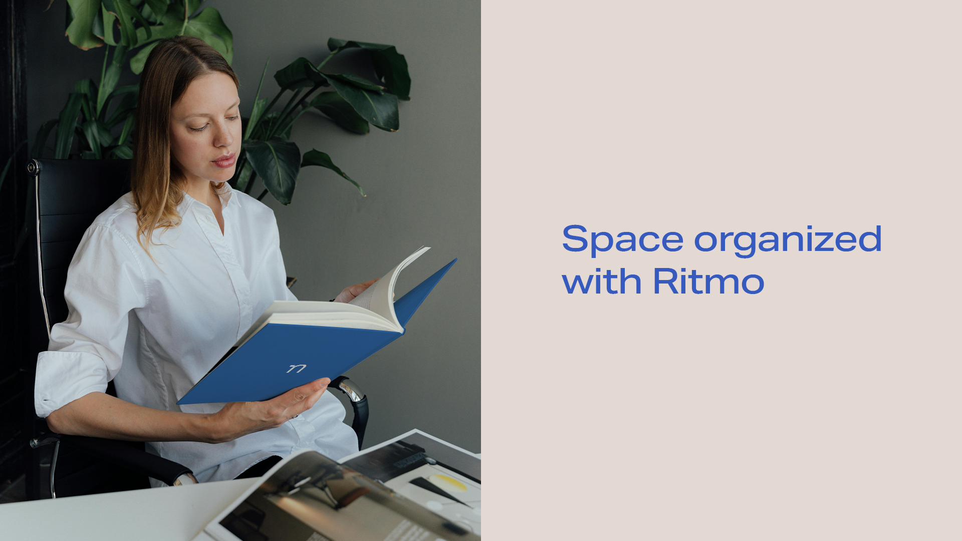
- Brand manual – we developed a practical, easy-to-use tool that clearly defines the rules for applying the identity in everyday work.

Results
-
Identification system
A consistent, flexible visual identity system adapted to the brand’s strategy.
-
Brand manual
A brand manual that shortens the time of creating materials and facilitates the work of a small marketing team.
-
Clear frameworks
Clear aesthetic frameworks eliminating subjective evaluations and ensuring a consistent image.
-
Unification
Unified packaging supporting brand recognition among different target groups.