Branding for Optelion
How to build the image of a strategic partner in energy transition with AI?
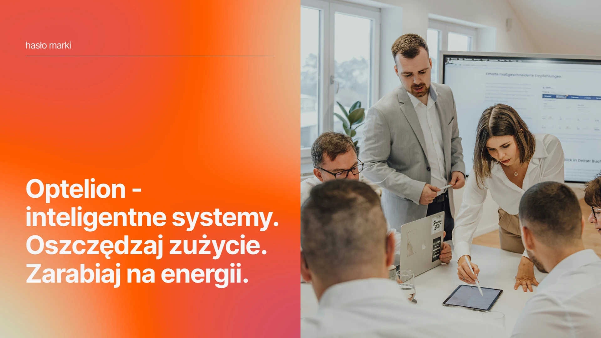
Optelion is an innovator in the field of smart energy management. The company offers the SOZA system – a proprietary algorithm based on artificial intelligence that learns the profile of electricity and heat consumption in buildings in real time. The solution is dedicated to large facilities: hotels, shopping malls, and housing cooperatives, where managers aim for real savings.
Client's business challenge
- Optelion was at a stage where it was perceived mainly through the prism of “ecology” and as a reliable, engineering provider of thermal technologies. Although it inspired trust with its technical professionalism, it lacked the image of an innovative and aspirational brand.
- Instead, it wanted to break away from this purely operational image and become a strategic partner in AI-driven energy transition – a modern organization that inspires management boards to make key business decisions.
Proposed solution
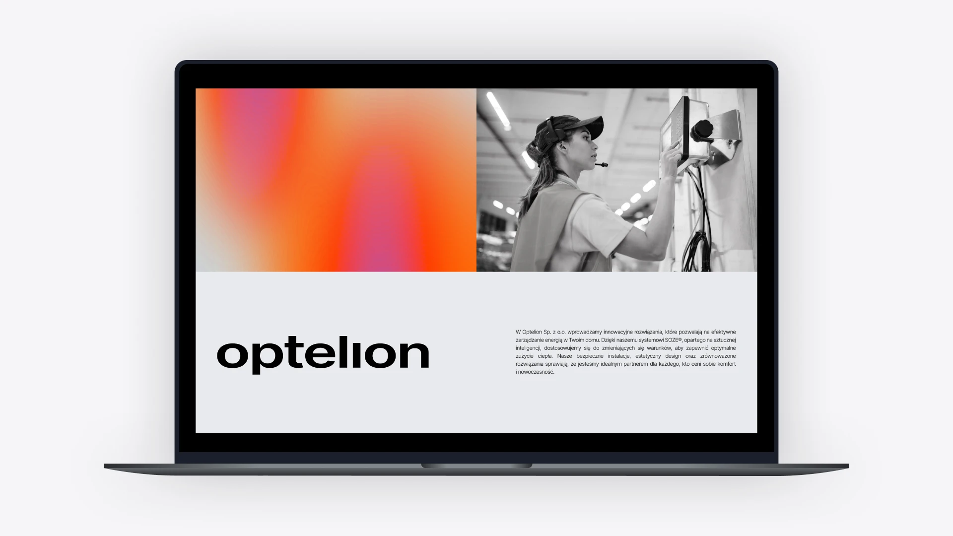
- We are building a brand that looks like a global player. It combines artificial intelligence with the energy sector, and it is modern and innovative.
- It looks like a partner to Siemens, not their subcontractor. The branding not only supports sales to end clients but also builds technological prestige, positioning the company as a candidate for acquisition.
Our task was to create branding that matches the innovativeness of the product and opens the door to the segment of the largest business clients.
What did the process look like?
Strategic workshop and DNA definition
The foundation of the work was discussing the business objectives that the visual identity is meant to support. During the workshop, we:
- Developed the brand values and differentiators (USP – Unique Selling Proposition).
- Defined the personality and character of the organization.
- Defined the target groups.
- Established the desired brand associations.
Moodboard discussion
After refining the strategy, we determined the visual direction. We prepared two moodboard proposals showcasing the recommended style, visual language, and initial color palette, which allowed for early alignment on the project’s aesthetics.
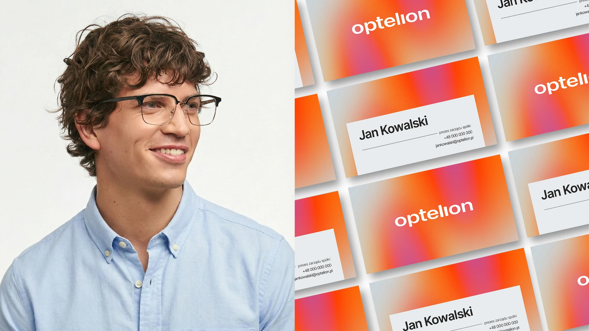
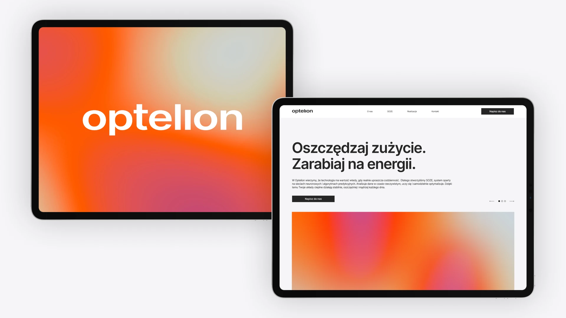
Creation of 2 visual identity concepts
Based on the chosen direction, we created two independent concepts. Each of them included a set of logotypes, fonts, and colors presented on selected marketing materials to show the system “in action”. The Optelion team took an active part in choosing the direction.
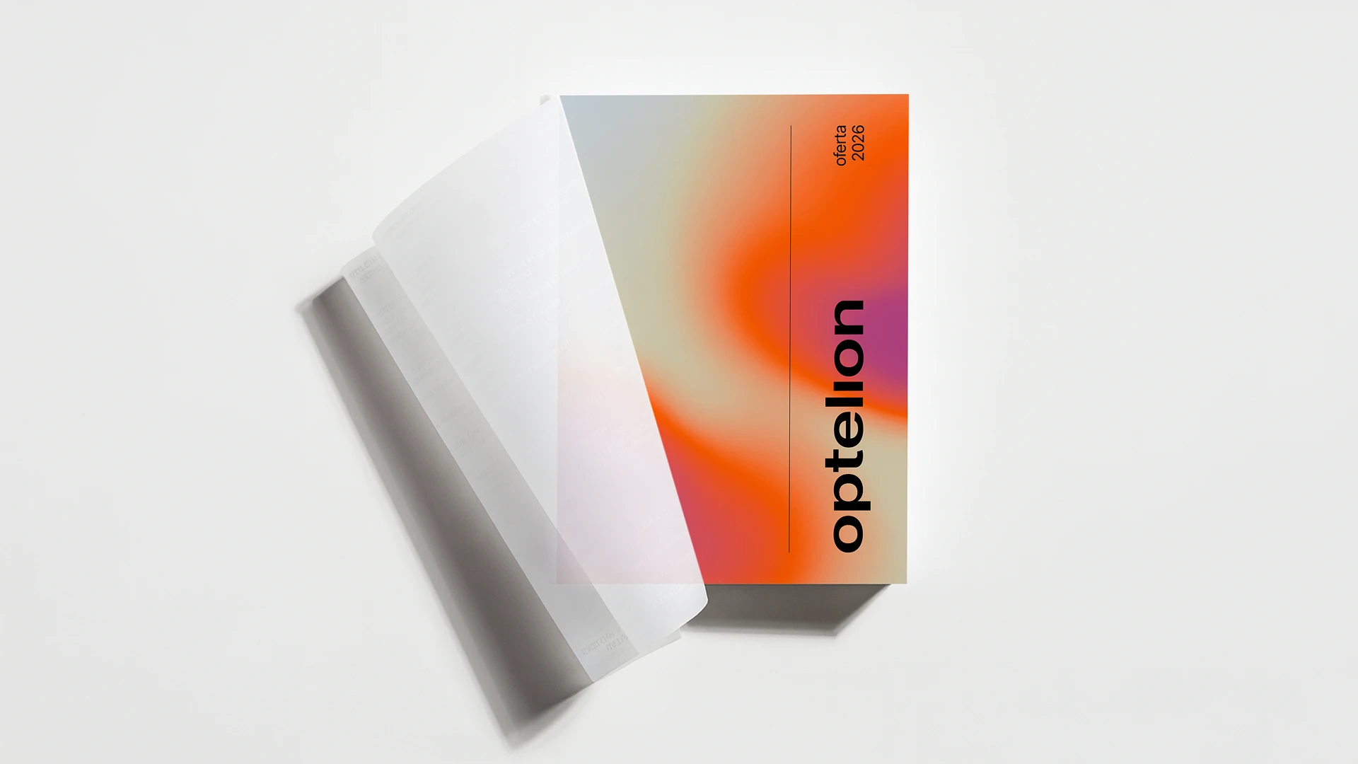
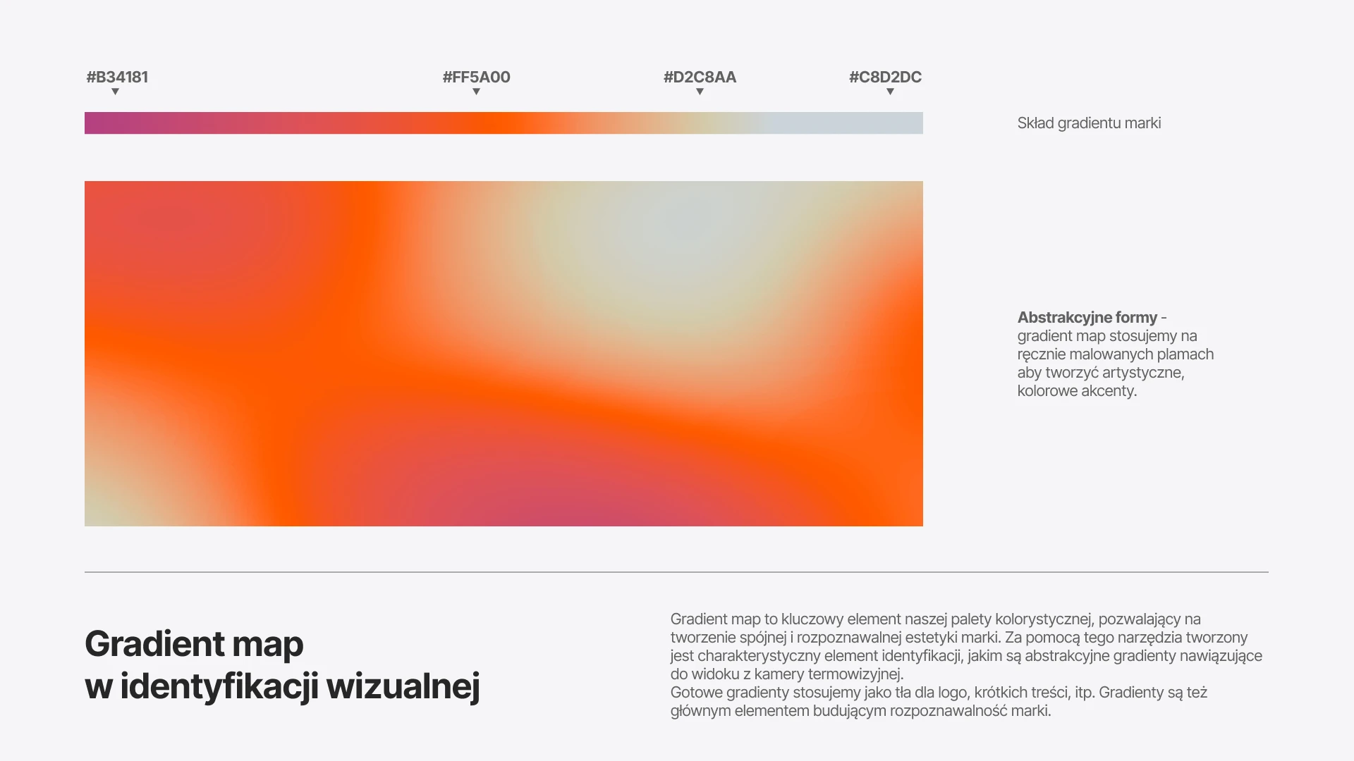
Final version of the visual identity and brandbook (CI)
The final stage was developing the visual identity and creating a brandbook. It included, among other things: the logotype and brandmark, color palette, typography, and rules for applying these elements in various contexts.