Kultura Rownosci - rebranding
A visual identity that will allow for the further development of a social organization
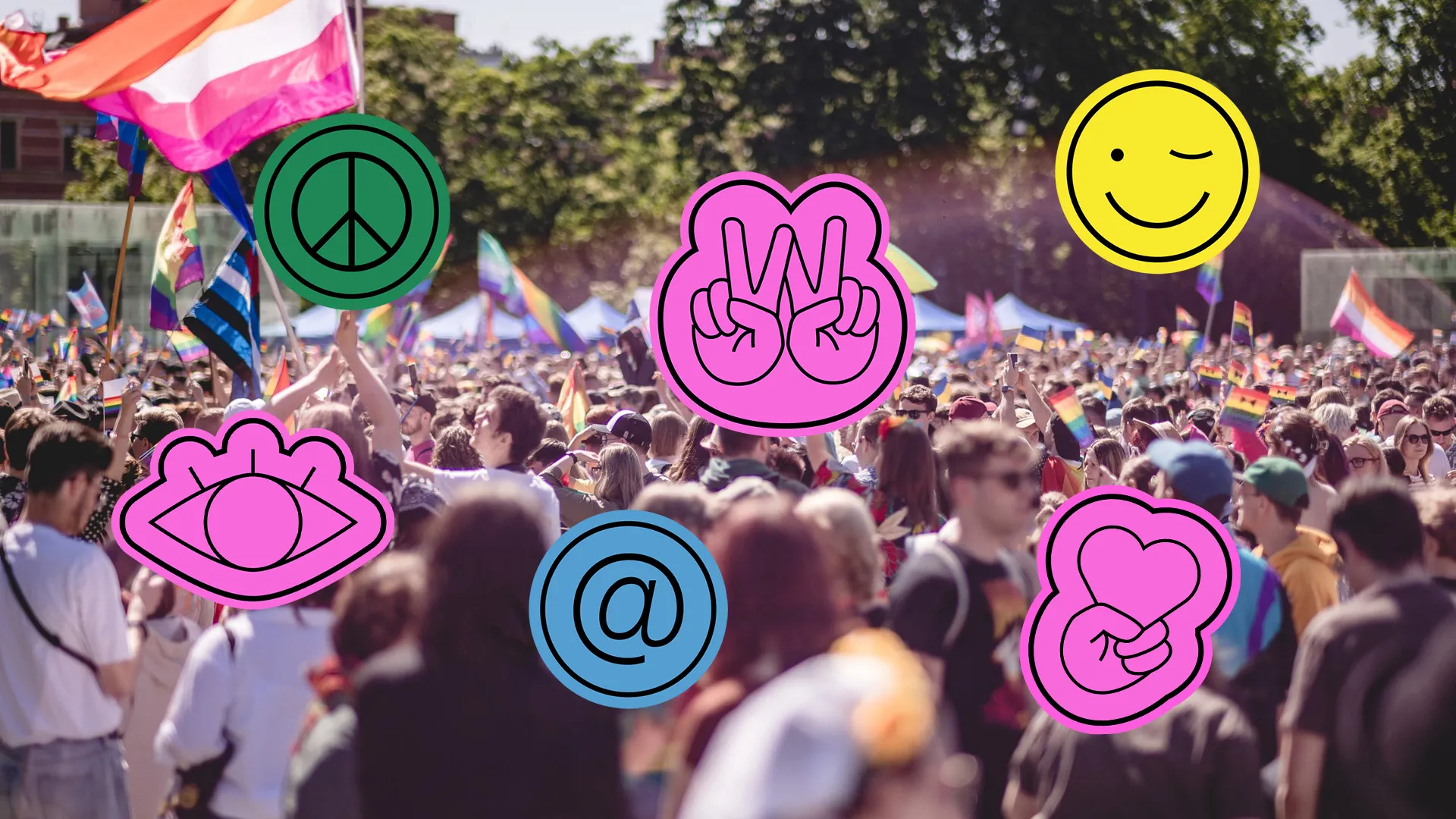
Kultura Równości is an association that has been operating in Wrocław since 2014. Its goal is the integration and education of the LGBT+ community and its allies. It organizes various events, such as the Wrocław Equality March, WroPRIDE Wrocław Pride Festival, debates, happenings, workshops, and meetings. It also runs Równe Miejsce (Equal Space) – an LGBT+ Center, which is a safe space for lesbians, gays, bisexuals, transgender, and queer people.
It is a non-commercial organization, cooperating with and supporting other similar organizations and initiatives, as well as fighting for equal rights and a dignified life for the residents of Wrocław and Lower Silesia.
Objective
The cooperation with Kultura Rownosci is a continuation of our previous activities. After designing and implementing a comprehensive website for the LGBTQ+ organization, the association entrusted us with another task: a complete rebranding.
Our designated goals are:
- Creating a visual identity that will help Kultura Rownosci communicate efficiently and clearly with diverse groups.
- Developing a Brand Manual, as well as Canva and Figma templates, which will help people working at Kultura Równości efficiently create consistent content.
- Working together on the premiere and implementation of coherent communication across all digital and offline channels.
What is the "new" Kultura Rownosci?
Together with the association’s management board, we determined that the new Kultura Rownosci is a stable, well-organized organization that is aware of its capabilities. In terms of image, we position it as a friendly and helpful authority that creates interesting, substantive content.
We based our communication assumptions on:
- The 3xW rule: cooperation, inclusion, community (in Polish: współpraca, włączanie, wspólnota).
- Emotions and people: we moved away from a purely manifestative form in favor of fun and the celebration of love. At the center of communication, we focused on the people creating and integrated around the organization and their stories, because they evoke the strongest emotions.
- Message dynamics: we decided on energetic, dynamic communication with “power” that illustrates the breaking of stereotypes. Educational, cultural, and inclusive activities came to the foreground.

Rebranding process
- We started the work with a meeting where we defined the needs and developed the target brand image.
- We prepared and discussed 2 moodboards and proposed visual directions online, from which we jointly selected 1 leading direction for further development.
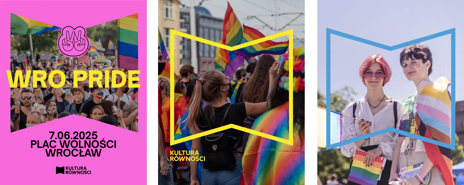
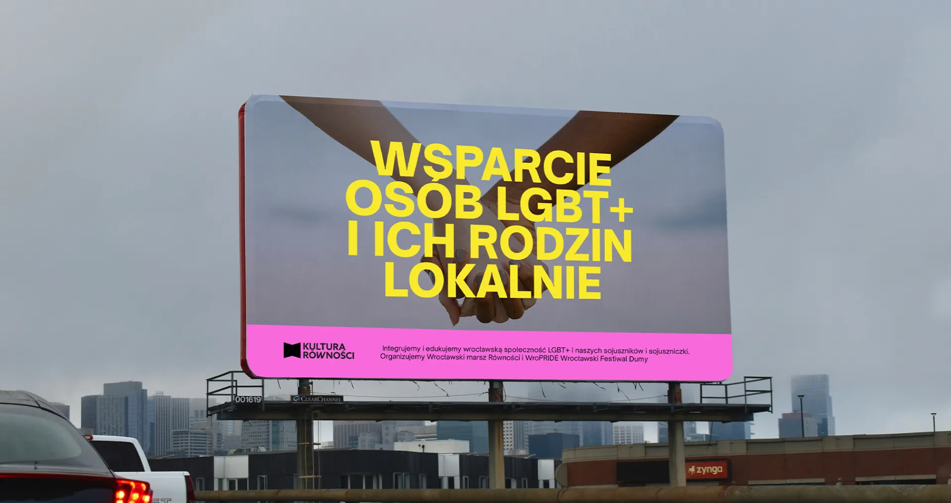
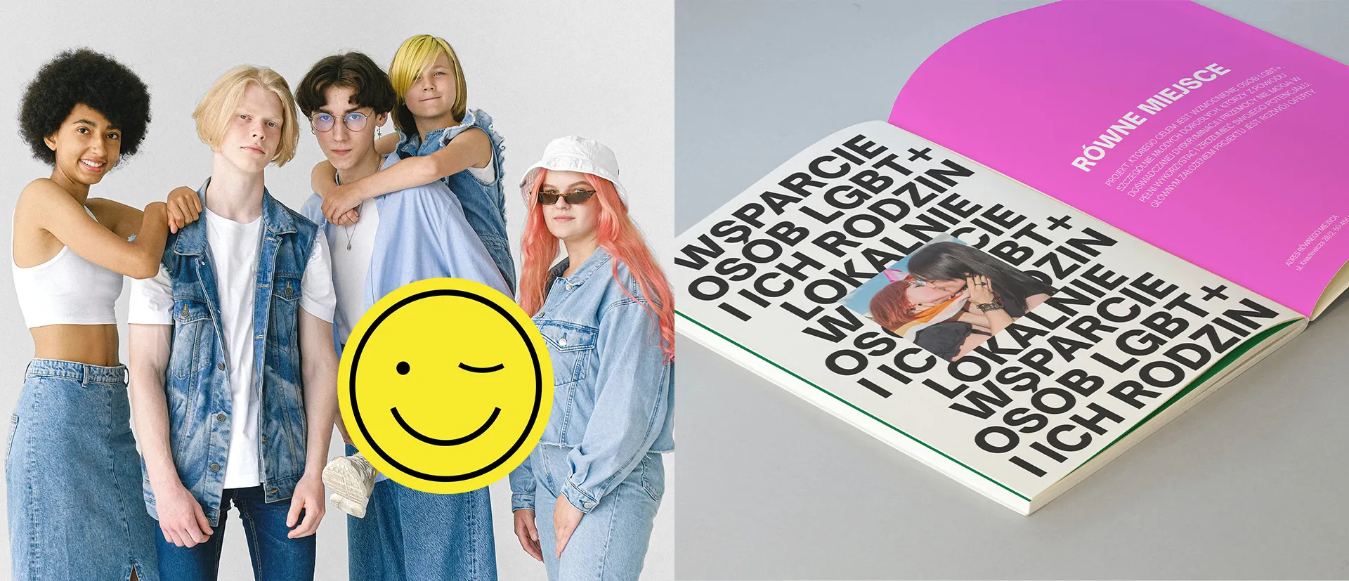
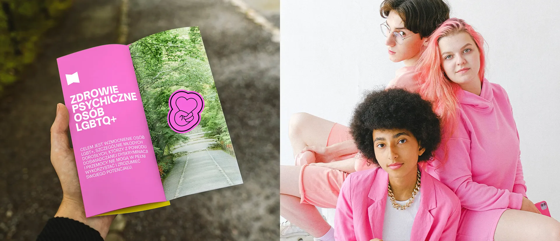
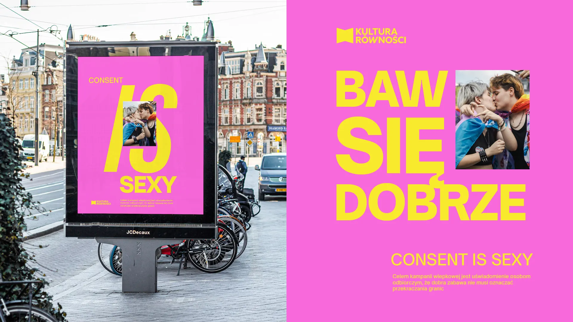
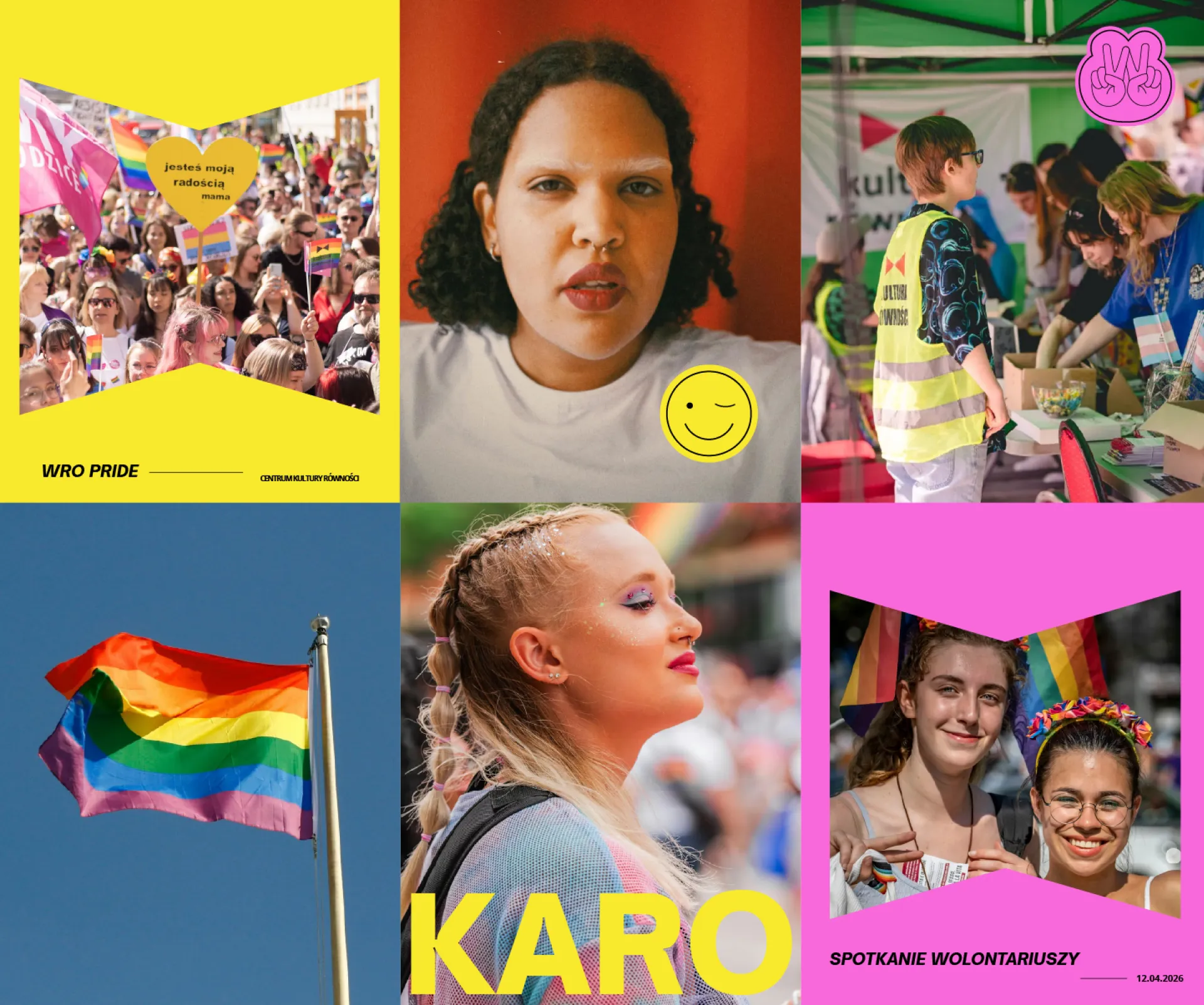
- We designed and discussed 2 different visual identity concepts online. We developed and approved the final version based on poster aesthetics – contrasting strong, display typography with authentic photographs.
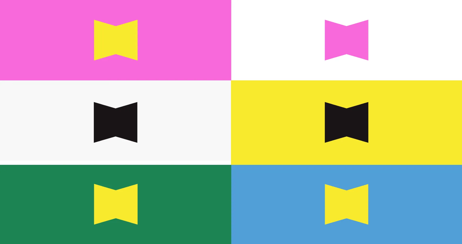
- We made a strong pink the main brand identifier, and assigned dedicated colors to recurring initiatives, standing on par with the leading color.
- We created a Brand Book (Brand Manual). It included:
– the brand’s mission and slogan,
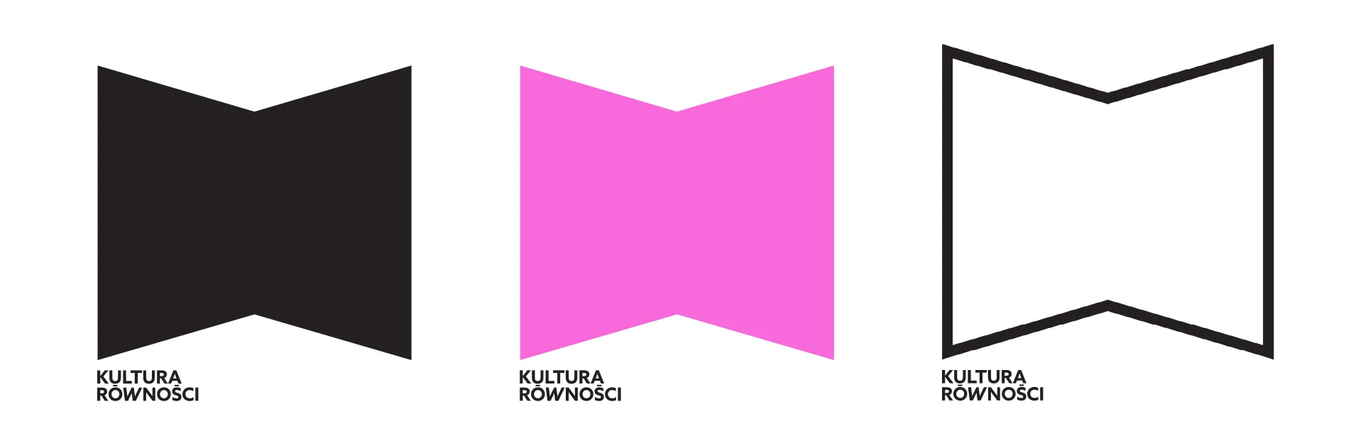
– a new logo,
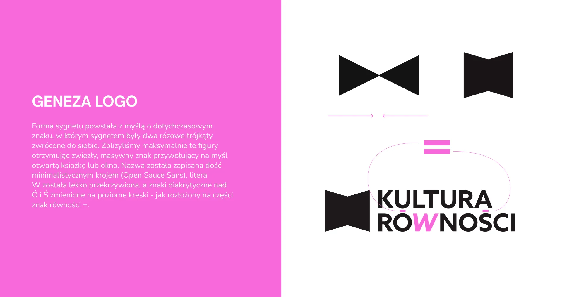
– a dedicated logomark (signet) and strict rules regarding colors and typography,
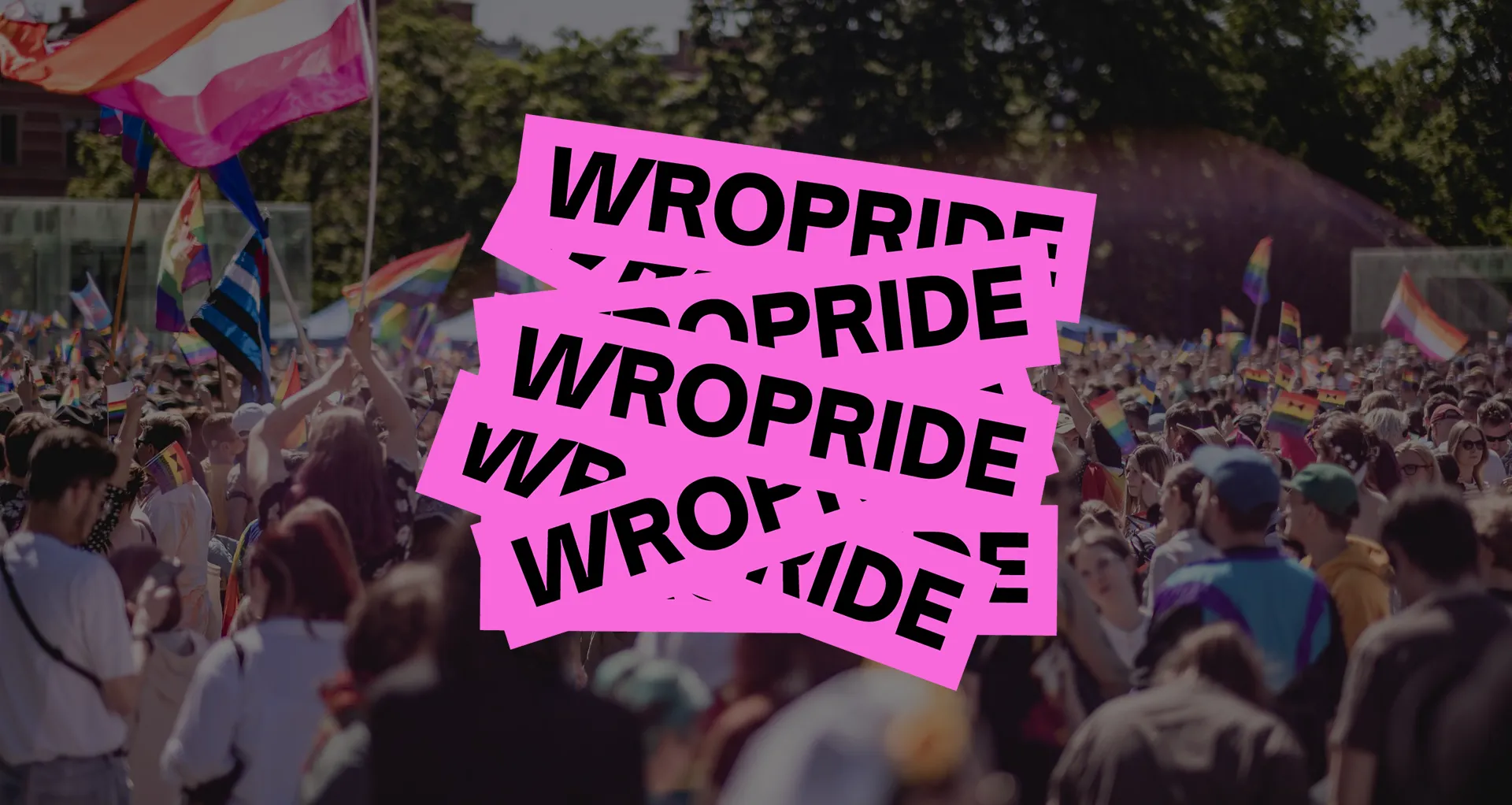
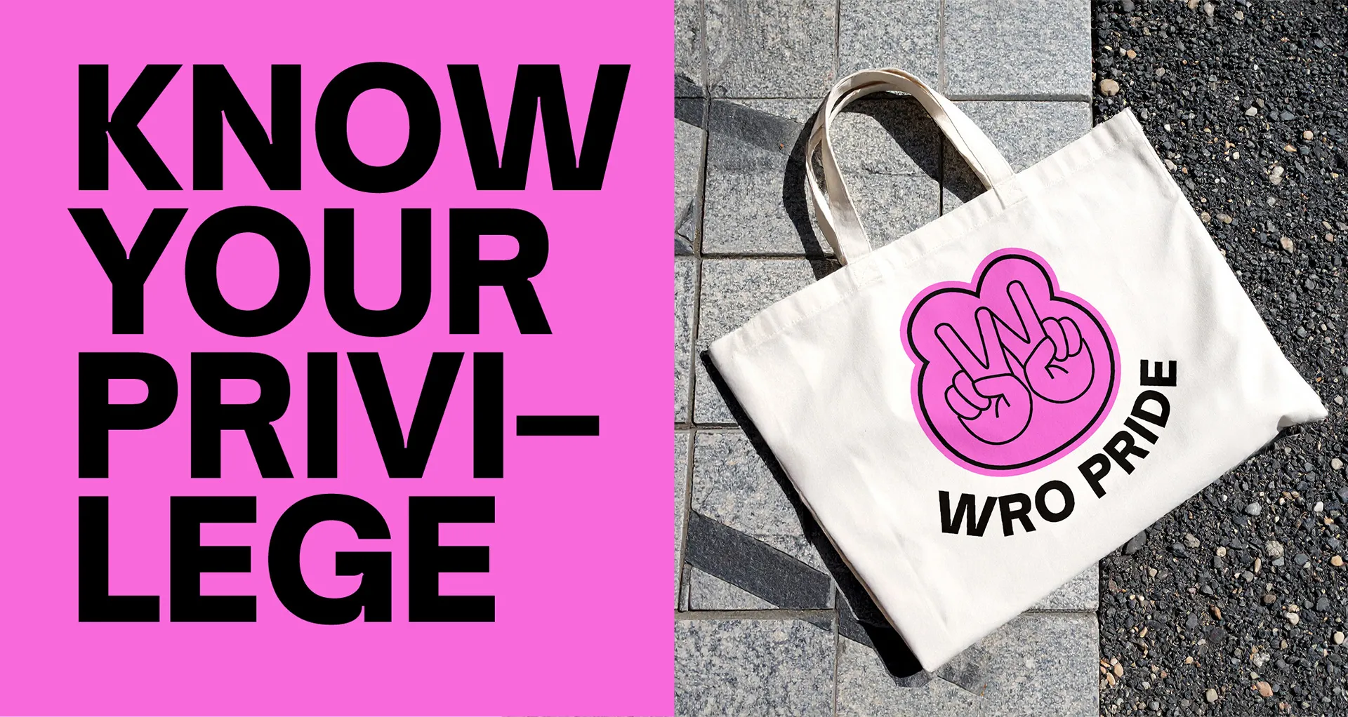
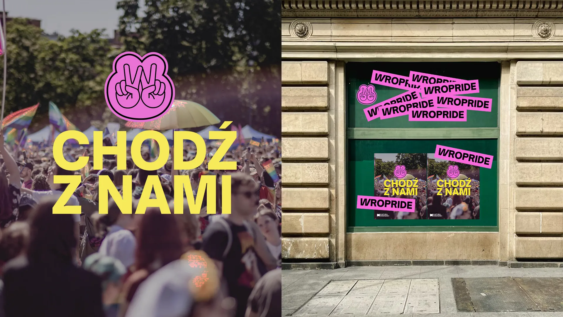
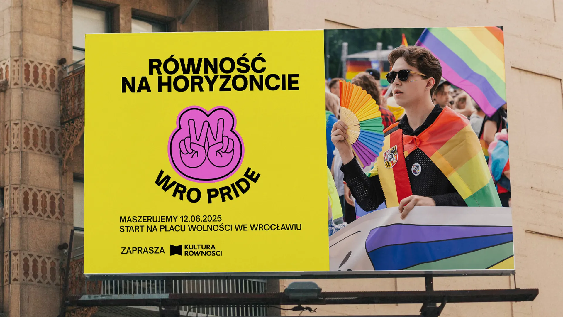
– sticker designs and rules for using the new logomark and identity on offline media (e.g., posters) and in digital,
– a dedicated, yet consistent with the main brand, visual identity for the WRO Pride festival, for which we also developed company merch designs (including, among others, tote bags). - The final stage was handing over the open files to the client. The entire identity was designed with usability in mind – Kultura Równości received a Brandbook and comprehensively organized templates integrated into Figma and Canva. Thanks to this, the organization’s team can work with the new image on a daily basis in a very simple, fast, and fully consistent way.
References / Customer Review
With complete conviction, we recommend cooperating with the MOX!E creative agency, which was responsible for preparing the new visual identity for the Culture of Equality Association (Stowarzyszenie Kultura Równości).
We started our cooperation with the MOX!E agency in March 2025, and the entire process, from the first meeting to the implementation of the new visual identity, took a year. Throughout this entire period, the cooperation on the agency’s part was conducted in a very thoughtful and organized manner. It began with a detailed audit of the Association’s existing visual identity and a review of our communication channels, which allowed for an accurate diagnosis of the organization’s needs.
The new visual identity was developed through a workshop formula, with the active participation of our team. We had a real impact on its shape and could clearly express our needs and the values we want to communicate. The final result is highly satisfying for us. We see that we were listened to, and the MOX!E agency put a lot of work and attentiveness not only into the project itself but also into understanding the social context of our daily activities for the LGBT+ community.
At every stage of the cooperation, we felt the commitment of the agency’s team, as well as their awareness and sensitivity to the specific nature of our organization. Our needs were fully understood and translated into a coherent, modern visual identity.
We evaluate the entire process very positively. Importantly, even after the implementation of the new identity, the agency remains open to further cooperation, declaring its readiness to evaluate and update the visual system in response to our future needs.
We particularly appreciate and are very grateful that the entirety of the work was done pro bono, as a conscious, social gesture of support for our activities.
The agency’s motto is “We just care,” and our cooperation with MOX!E proves that it is not just a slogan. The agency employs people who care! With complete conviction, we recommend the MOX!E creative agency as a professional, committed, and socially responsible partner.
