MOKIDA
Energetic branding of a new brand for authentic parents
MOKIDA is a multi-brand portal for authentic parents and their children. The brand’s central mission is to provide daily, tailored support to those who are breaking away from an unattainable pattern of perfectionism and want to raise their children with a sense of happiness and unfettered joy. MOKIDA is also an online space that allows you to order essential, personalised products and services quickly and intuitively, as well as receive expert advice from other parents and brand ambassadors.
Objective
- Development of a visual concept for a new brand created for authentic parents.
- Creating a logo and visual identity that stands out against competitors, promotes memorability among the target audience, and enables the brand to be presented on a variety of media.
Solution proposal
- We started our work on the branding by developing moodboards, with which we defined the initial style and visual language of the brand.
- Based on the selected concept, we developed two branding proposals including logo designs, fonts, colours, as well as distinctive graphic elements, which we presented on a variety of materials.
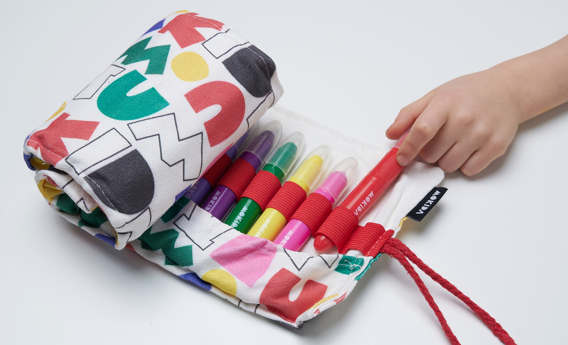
- We have based the branding on six shapes derived from the letters contained in the brand name and bringing to mind colourful cut-outs.
- The branding as a whole perfectly captures the freshness, energy and joy of children’s play. We presented the final version of the visual identity in the form of a brand book.


Client testimonials
“Working with MOXIE has resulted in an absolutely unique branding, tailored to the values we want to communicate to our customers. Work with you was smooth and very fruitful, despite the tight timeline. MOXIE showed up at every meeting phenomenally prepared. This kept us on schedule and we completed the project on time!”
